Specify 7 Usage Stats visualizer
Internal usage stats explorer
Developed in
My first project at the first job during college was adding a way to see the usage stats for the Specify 7 application - an open source scientific collection management software.
They already had the code for making Specify 7 ping our server on startup with telemetry information and storing that in a giant text file, but no way to visualize the data.
Main features
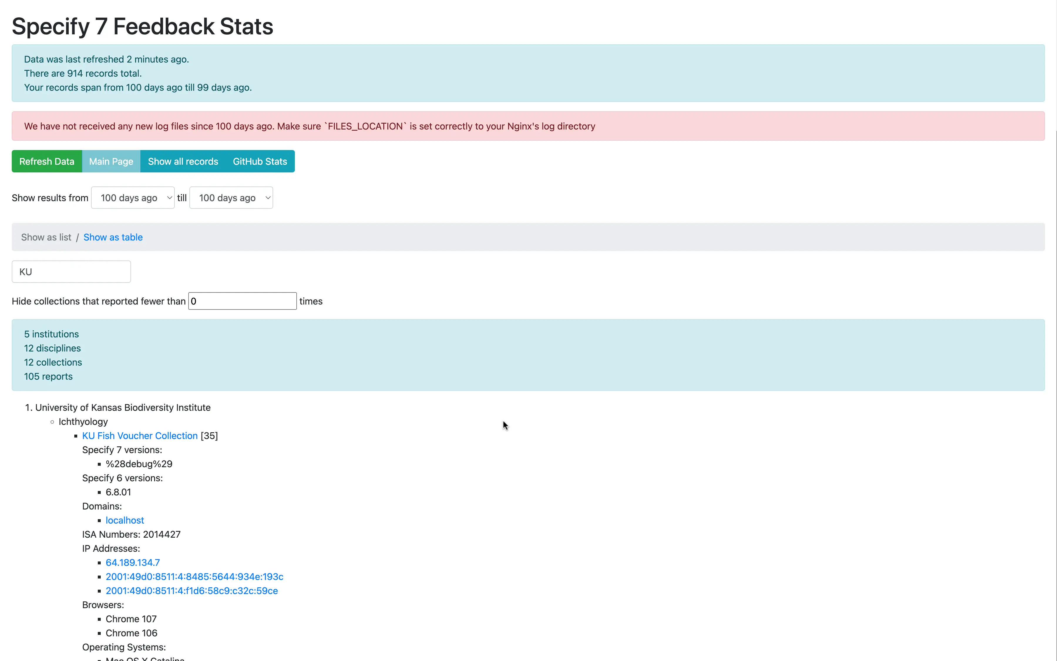
IP Addresses are resolved using ip-api.com to find approximate locations of users
User agents are parsed to find out browser and operating system versions
Data can be inspected in list view and table view.
By default data for the last 100 days is shown, but any range can be selected
The computed analytics are cached, allowing for instant refresh. Cache is updated daily automatically, but there is also a button to update it manually at any point
Nginx's NJS was used to create an authentication screen, barring access to anyone who is not part of the Specify GitHub organization. Source code for that
Screenshots
Online demo
Unfortunately, I am not able to provide a live demo URL as the tool is accessible internally only, however, you are free to look at the source code
Technologies used
PHP
Chart.js
Nginx and NJS (for authentication)
nginx-with-github-auth - an Nginx module I wrote
Bootstrap
jQuery
GitHub APIs
Specify 6 Usage Stats
In parallel with this project, I was tasked with modernizing an existing usage stats visualizer for a separate application. See the results of that project.
Reflecting on the project
When I started this project, I used the technologies I knew best. Among the only new things I had to learn was Chart.js and how to work with GitHub APIs. This made the development go very quick and I had a working prototype within a day.
At the time, that was an effective approach as that way I was able to quickly show results to my team and impress them with, what I thought at the time, advanced skills.
However, reflecting on this 4 years later, if I were to do this project again, I would instead adopt an existing solution for visualizing stats, as there are a lot of fabulous options out there (Google Analytics, Mixpanel, Amplitude, Tableau and many others).
Usage stats visualization is a problem that has been solved a thousand times before, and so there was little business value for the company to solve it again, beyond the fact that as an undergraduate student employee, my salary didn't cost the company much, while my enthusiasm was boundless 😊.