Spacetime
My Amazon Internship Project - real time dashboard
Developed in
Amazon services have countless automated alarms set up to detect any anomalies and widespread outages. During an average day, there are about 10 high severity tickets opened every minute. In cases of extensive breakdown, that rate increases by many times to the point where it becomes impossible to quickly find the root cause of the issue. In case of any emergencies, every second counts, and it is critical to localize the issue as soon as possible.
Spacetime is a tool I created during my Amazon Internship in 2022. Spacetime aims to reduce how long it takes to troubleshoot an Amazon service outage by analyzing the metadata of all high severity issues opened in the last few hours to find the most affected areas and the scale of the problem. Spacetime makes it easy to see insights about the data and quickly filter out the irrelevant noise and have the charts update instantaneously.
See also, a blog post on 50 Lessons learned from an Amazon Internship.
There already exists a tool at Amazon, which shows all high severity tickets in real-time as a long table, allowing you to stay in touch with the latest developments and anomalies. However, on an average day, there are about 10 high severity tickets opened every minute. And in cases of extensive breakdown, that rate increases by many times to the point where it becomes impossible to quickly find the root cause of the issue. In case of any emergencies, every second counts, and it is critical to localize the issue as soon as possible. And that is the main issue Spacetime is trying to solve, and I am proud to say it’s quite good at that.
Screenshots
I received written permission to display the screenshots you see below, under the condition that the screenshots do not include real data. I wrote a fake data generator to provide the data for the screenshots. Keep in mind that the main benefit of Spacetime (how easy it is to spot anomalies), is void when looking at fake data.
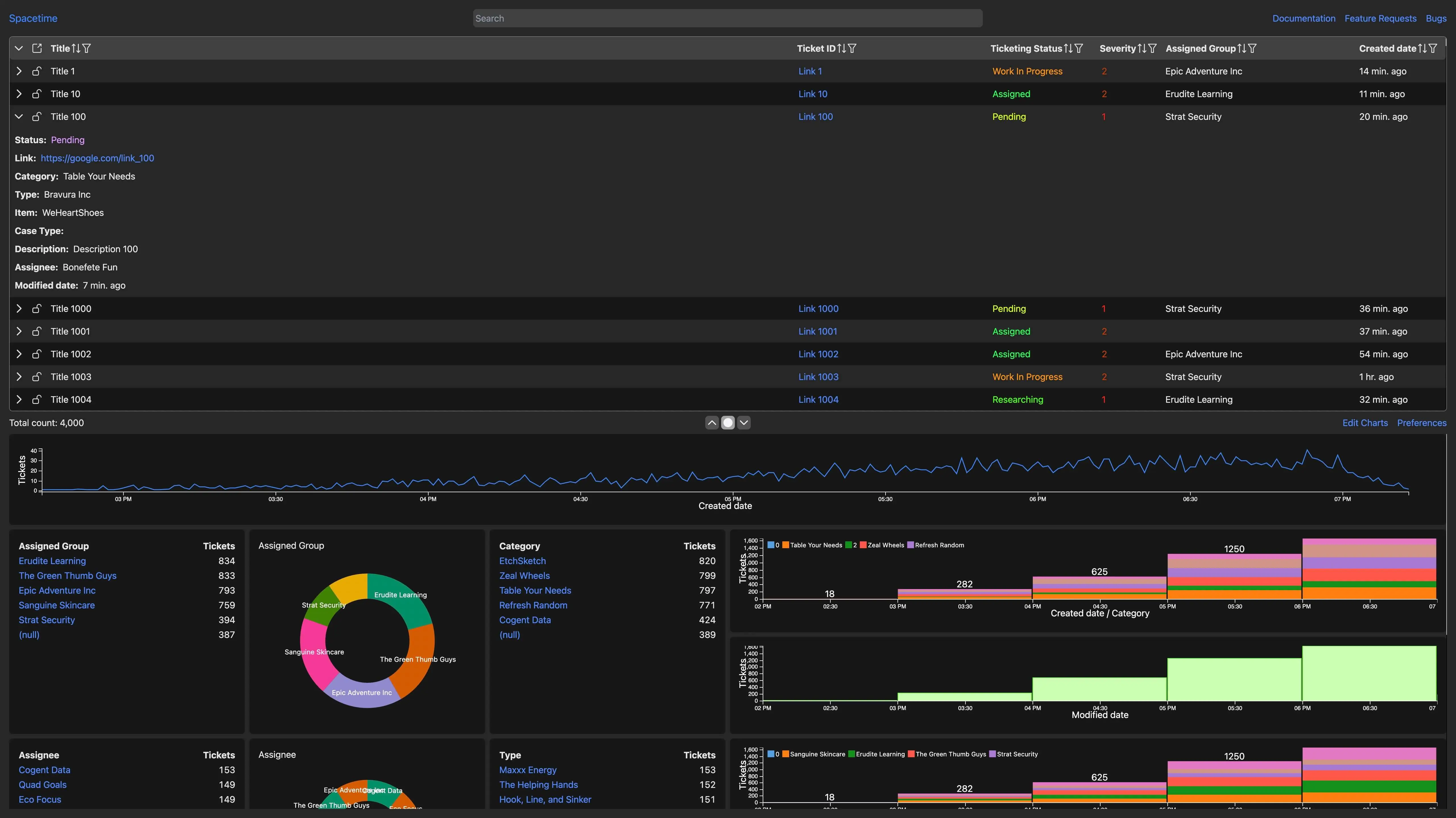
The top half of the page is a table of all the issues, with each column being sortable and filterable. The bottom half of the page aggregates all the data from the table and plots it by different dimensions.
For example, the first chart counts the number of tickets opened at any point. The greatest benefit of plotting data like that is that even without knowing anything about the data, any anomaly would be strikingly visible as a large spike on a line.
You can select any region in the line chart, and all the charts and the table update immediately to only show data from that region. Similarly, you could click on one or multiple pie chart slices to only include data from those categories.
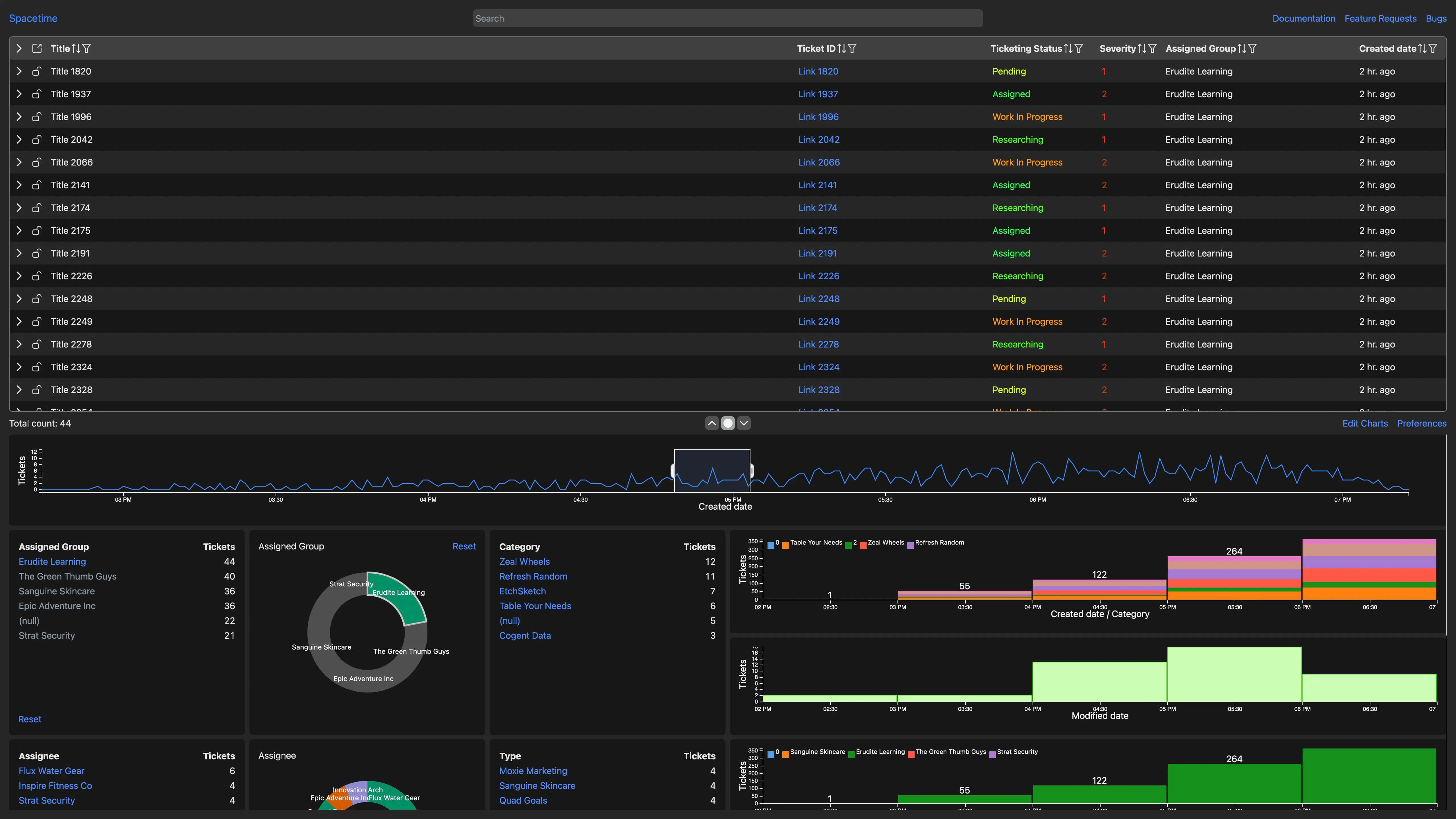
All of the filters are cumulative, allowing you to quickly filter out large amounts of noise and get down to the real issue. Additionally, the URL of the page stays synchronized with any filter or sorting conditions you specify. This allows to easily copy the URL and send it in a Slack message and email and be confident that the other person would see the same data.
You also have an option of collapsing the table to focus on charts or collapsing the charts to see more tickets at once.
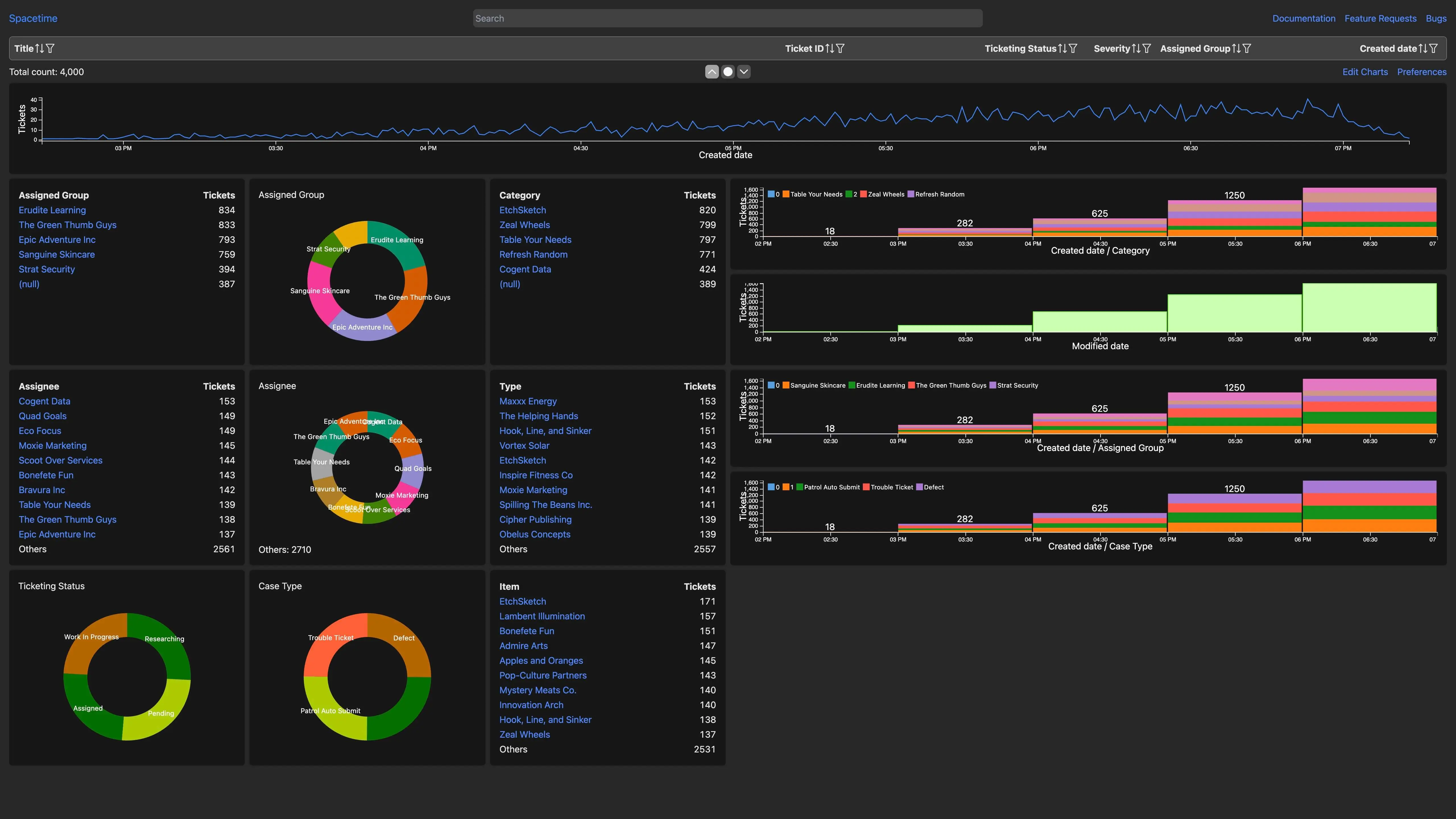
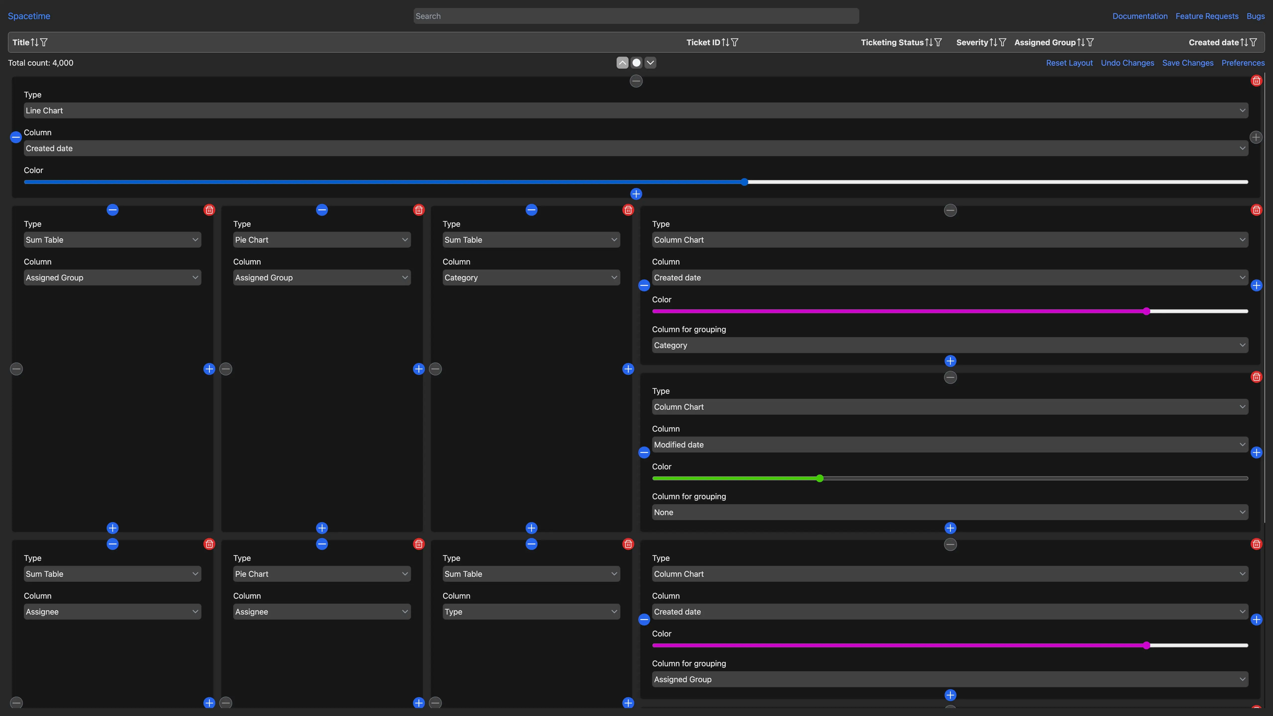
The chart layout can be customized easily. You can add new charts change their size, the column data is plotted on, the column data is grouped by or even change the styling of the chart.
The table is very versatile too. Each row can be expanded to see additional information, as well as ticket descriptions. Table columns can be reordered or hidden. Each column can be sorted.
After applying the filters, you can press a button to download the table data as a TSV file.
At the top of the page there is a search bar for quickly filtering the records. The search highlights matched records in the table. However, instead of removing unmatched tickets, it simply grays them out. This is super useful for being able to see the context around the search results.
For more advanced use cases, each table can have advanced filters applied. For example, you can add a Regular Expression filter, take a union of multiple filters or negate a filter.
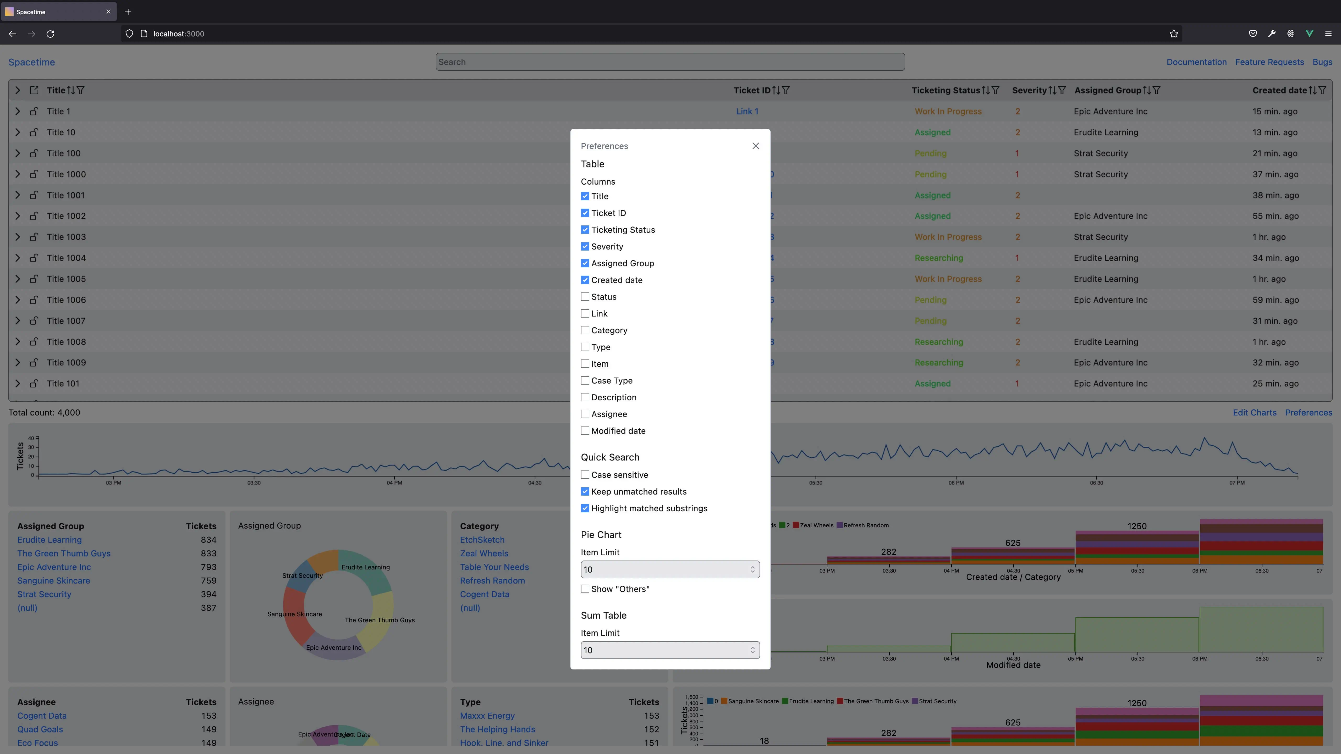
Advanced customization options are included in the preferences menu.
Spacetime respects users preference for light and dark mode and switches accordingly. It also listens for preference for reduced animation by disabling chart transition effects.
To summarize, Spacetime aims to analyze metadata of all the incoming high severity tickets to help the response team localize the issue quicker. It has advanced features like:
Column filtering with support for regular expressions, and OR conditions
Live update of all charts in real-time when any filters change
The filtering and sorting configuration is stored in the URL, allowing to easily share the link to Spacetime in a Slack message or email
As far as use cases, it’s possible that by default our tool doesn’t cover your use case as it’s hard to predict your need, or the needs may change. That’s why we designed it to be very customizable You can customize the chart and table layout extensively.
I aimed to make Spacetime relevant for years to come. That is why Spacetime allows replacing the underlying data set easily. I was able to change Spacetime to work with a completely different data set in just 30 minutes. It can be used not just for plotting incident data, but for displaying any sort of time series data with just minor modifications.
Lastly, it’s worth mentioning that Spacetime aims to be WCAG 2.1 compliant. It’s an accessibility standard. I wasn’t able to achieve full compliance because of non-compliant third-party libraries, but I am passionate about accessibility and tried to pay attention to it throughout the development process.
Technologies used:
Dc.js (a charting library built on top of D3.js and Crossfilter)
Vue.js (with PrimeVue and VueUse)
Tailwind CSS
TypeScript
AWS S3
AWS CloudFront
AWS Route53
See also my blog post on 6 big issues with Vue.js
FAQ
What would you do differently if you had to start again?
I have a habit of reinventing the wheel and writing my own solutions even if an existing alternative exists. This leads to lots of extra code and common lifting. My teammates helped me identify this problem, and persuaded me to replace a lot of custom code with third-party libraries. If I were to start again, I would use the libraries from the beginning, to save the time spent on rewriting the code.
What was the biggest challenge?
I had little prior experience working in a team and having my code reviewed. I am used to making lots of code changes and pushing them immediately. It was a bit of a struggle at first to adapt to the code review process and document the code so that others can understand it easily. But, I am happy to say that I am starting to get a hang of it and the code review process is going smoother now.
Can I edit tickets through Spacetime?
No that is out of scope. Spacetime is a read-only dashboard for quick analysis of the high severity issues in real-time. However, Spacetime has links to the Amazon ticketing system where tickets can be edited.
Why is this tool called Spacetime?
In physics, spacetime is a mathematical model that combines the three dimensions of space and one dimension of time into a single four-dimensional manifold. The project has a lot to do with charts (where time is one axis), and you can go back in time to see data for the previous hour/day. Thus, a name related to traveling through space and time is appropriate.
Can you share your impressions about the internship?
Appendix 1: Architecture
Front-end
Front-end is build on top of Vue.js 3 and provides a modern single page application experience. The component-based architecture of Vue.js helps with reducing code duplication by allowing developers to reuse common logic and interface components.
Spacetime is using the dc.js charting library for displaying the diagrams. dc.js is built on top of d3.js and thus has wonderful real-time update support while abstracting away many details to make the development process simpler. The only concern with this library is the accessibility, as screen reader support leaves more to be desired.
Back-end
During my internship, I focused on front-end features, as those would help sell the leadership team on the benefits of Spacetime and allow stakeholders to get an idea of the final product.
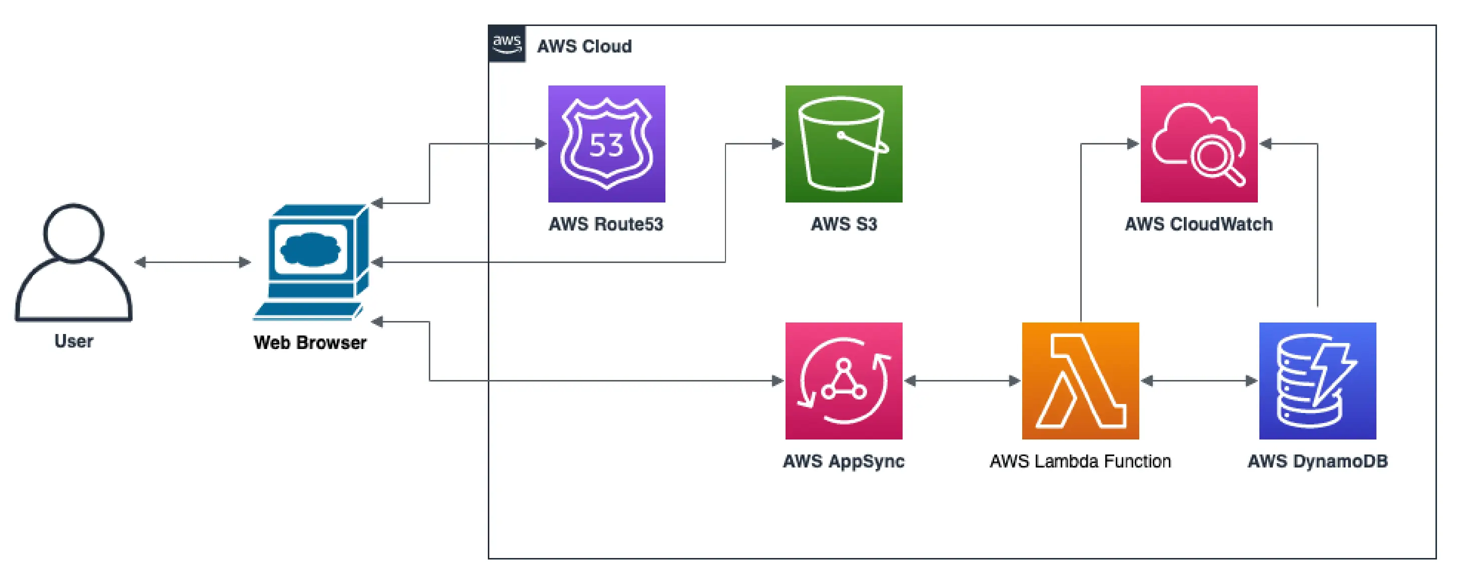
That is why, my back-end consisted of AWS S3 bucket, AWS Route53, and AWS CloudFront only. The tickets were provided statically. In the future, this would be changed to include an AWS DynamoDB and AWS Lambda function, that fetches data in real-time.
This architecture makes the application completely stateless. As a direct outcome, the system scales automatically to meet higher usage demands and is fault-tolerant thanks to multiple availability zones being supported.
Cloud diagram
The proposed back-end architecture is very simple thanks to the usage of Serverless computing. User’s Web browser contacts the AWS Route53 DNS service to resolve the domain address. Once resolved, the browser requests static files from an AWS S3 bucket. Afterward, the web browser sends requests to the GraphQL API managed by AWS AppSync, which in turn forwards the requests to AWS Lambda Functions for processing. Lambda Functions fetch data from the AWS DynamoDB, aggregate it, and return it to the client while logging the entire process using AWS CloudWatch.
At the same time, a different AWS Lambda Function polls SIM-T for newly opened tickets every minute, formats the response according to the Configuration file, and stores that in AWS DynamoDB. This means the front-end doesn’t have to do extra processing, improving the performance, while also ensuring that Spacetime is usable even if SIM-T is down.
Additionally, since Spacetime is meant to feel very responsive, it downloads all tickets for a selected date range from the backend and does the rest of the filtering on the front-end in response to any filter changes you make. This allows charts to update as soon as you changed a filter, rather than having to wait for a network request to complete.
Finally, AWS CloudWatch has alarms configured to proactively detect when the AWS S3 bucket is getting full, or an unusual number of AWS Lambda Functions is failing.
Appendix 2: Configuration
Spacetime is designed from the ground up to be highly customizable and adaptable to cover ever-changing use cases and data sets.
The system gets tickets from the SIM-T system, but beyond that, treats data in a completely generic way, without any hardcoded assumptions, other than what is specified in the configuration file. The configuration file is responsible for determining which columns are displayed, in which order, how they are formatted, as well as default, sorting, and filtering. Additionally, the charts are user-customizable. This design allows to easily adapt the system to a different data set or to have multiple views of the same dataset.
A simplified infrastructure diagram for services that are used to process a single user request:
Online demo
I am unable to provide a live demo and I do not have access to the source code as that is proprietary information of Amazon.