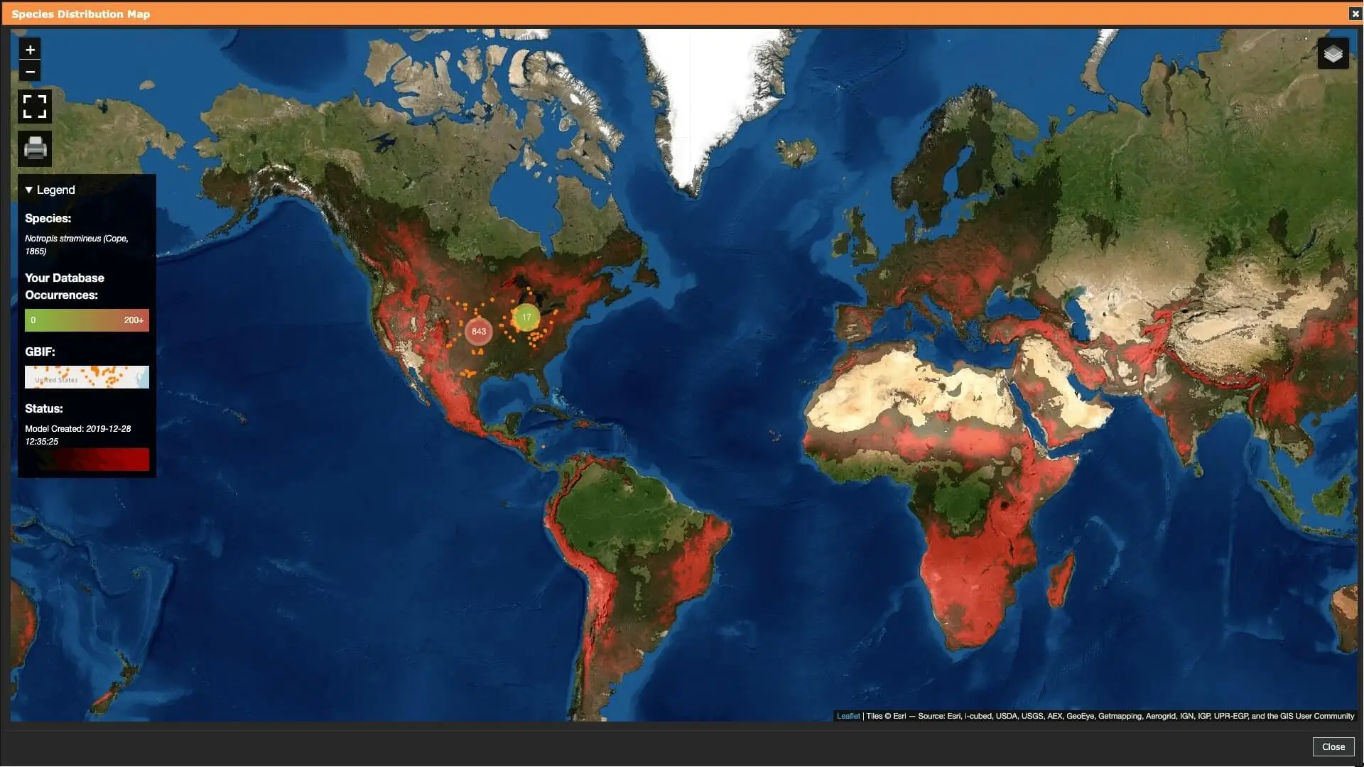
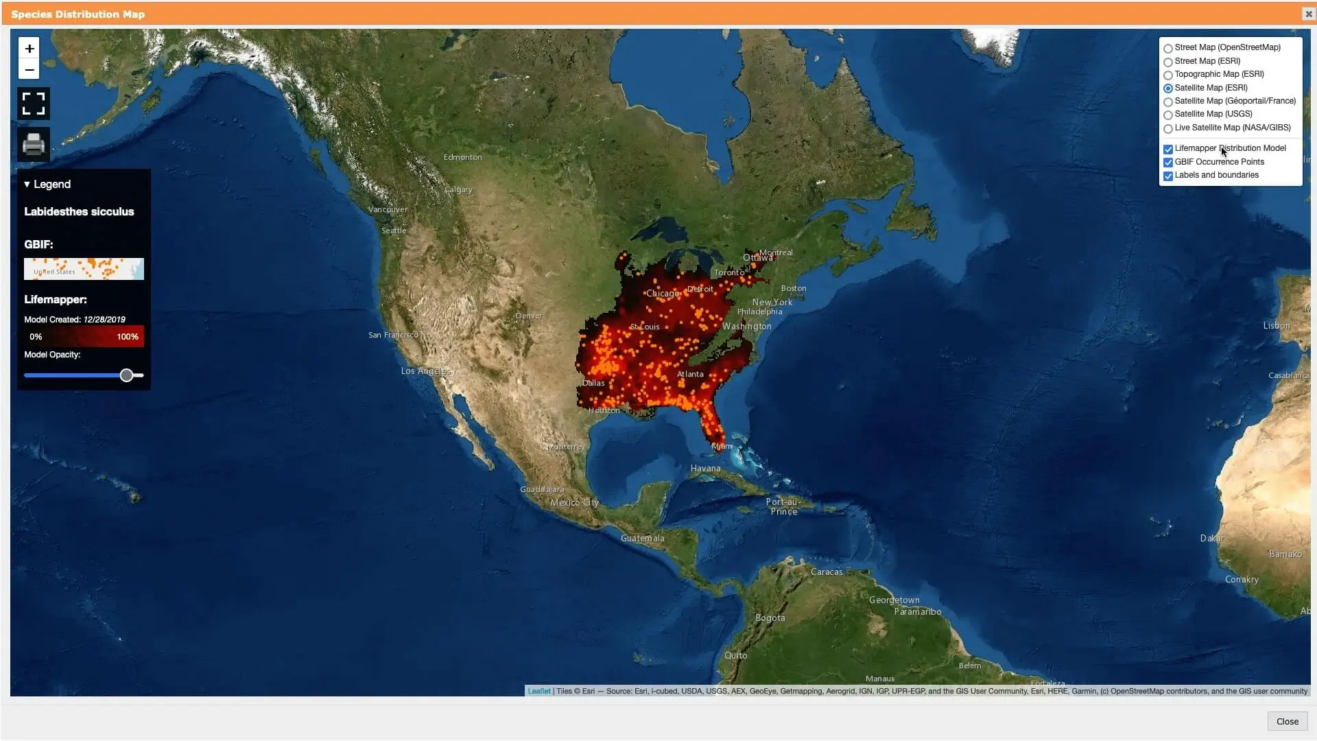
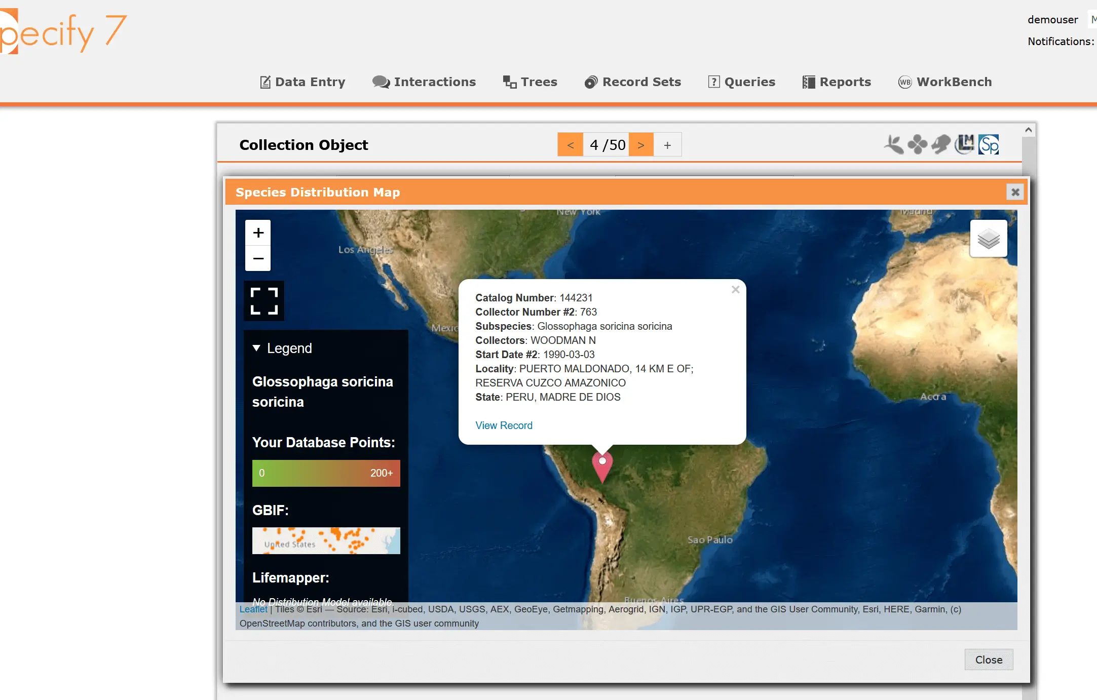
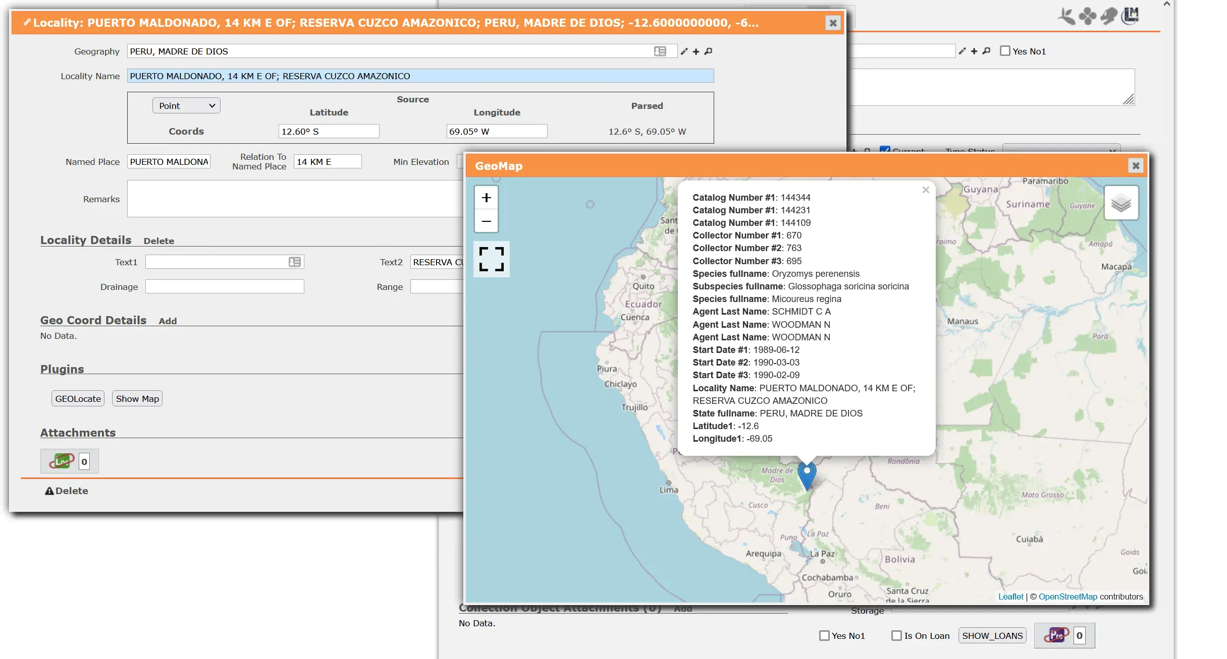
Species distribution projection map
Interactive Leaflet map with multiple base layers and overlays
Developed in
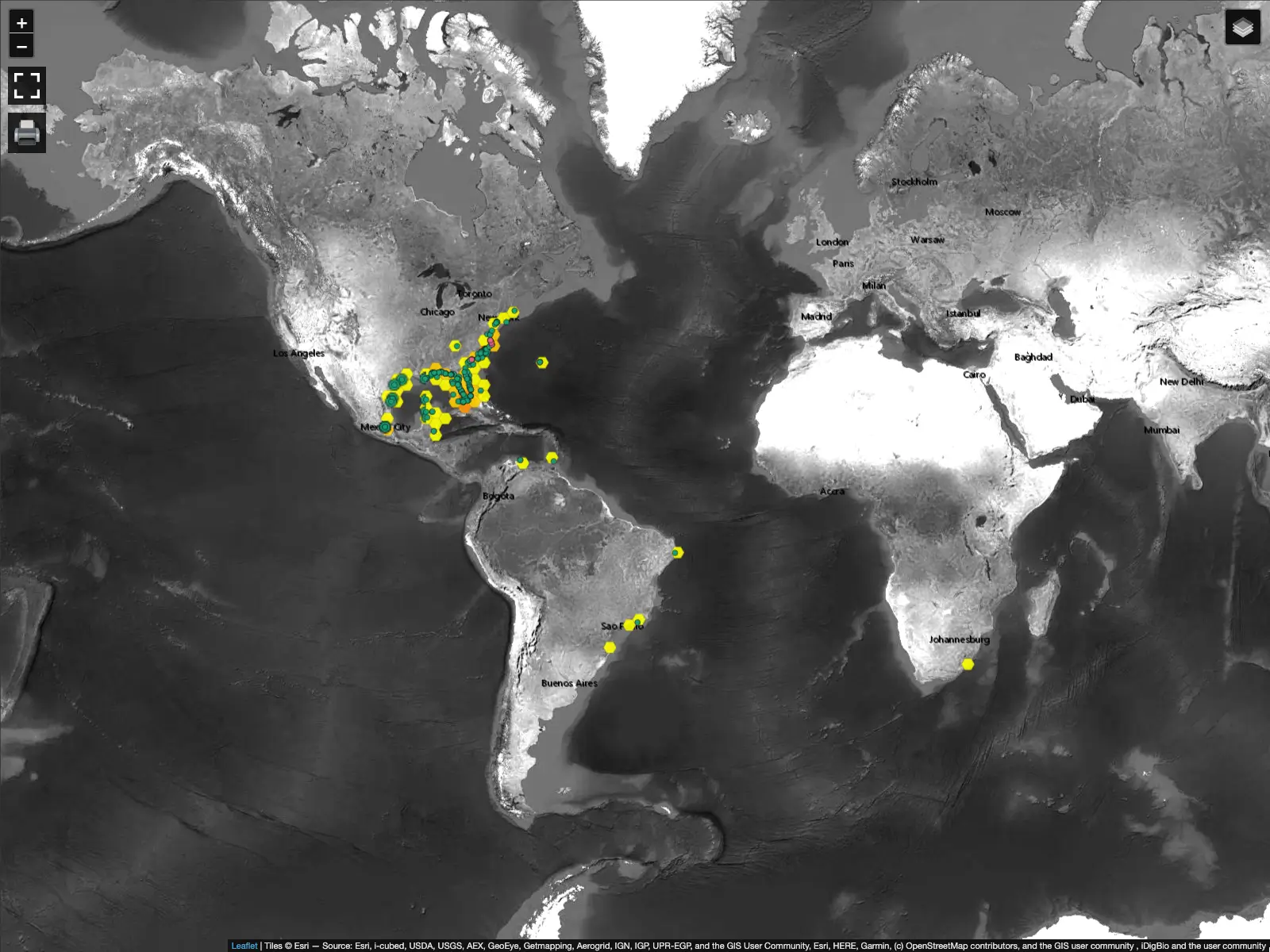
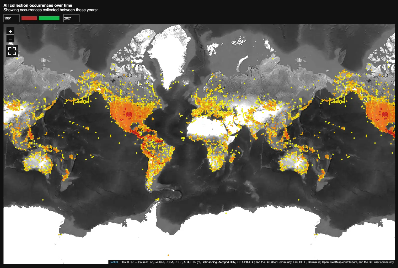
Species distribution map shows a projection of where particular species may be commonly found. The map is generated by Lifemapper and is based on public records submitted to GBIF.
I added an interactive Leaflet map that shows the projection map for the species you are currently looking at in the collection management system, Specify 7.
Along with the distribution map and several base layers, specimen occurrence points from the local database are also displayed to show how local data compares to that of GBIF.
Screenshots
Technologies used
JavaScript
TypeScript
React
Docker
Leaflet (library for interactive maps)
Python (CherryPy)
Video overview
Video overview (in Russian)
Things learned
The final product did not look anything like the original implementation. There was a lot of discussion and code rewriting. While this allowed us to slowly converge on a best solution, the process wasn't as efficient as it could have been. If I had to do it again today, I would make sure to make heavy use of Figma to quickly prototype the interface and to tell a story of the user experience.
Figma is great for creating prototypes that, unlike coded implementation, can be adjusted easily until a satisfactory result is achieved.