Specify 7 UI&UX refactor
Modern interface that feels intuitive and is a pleasure to use
Developed in
I am not a designer, but I like building user interfaces that look awesome while being easy to use. The best interface makes the user feel powerful, without overwhelming them.
That is why I decided to refactor the entire user interface of Specify 7, a collection management software, to be more user-friendly and pleasurable to use.
List of most important changes
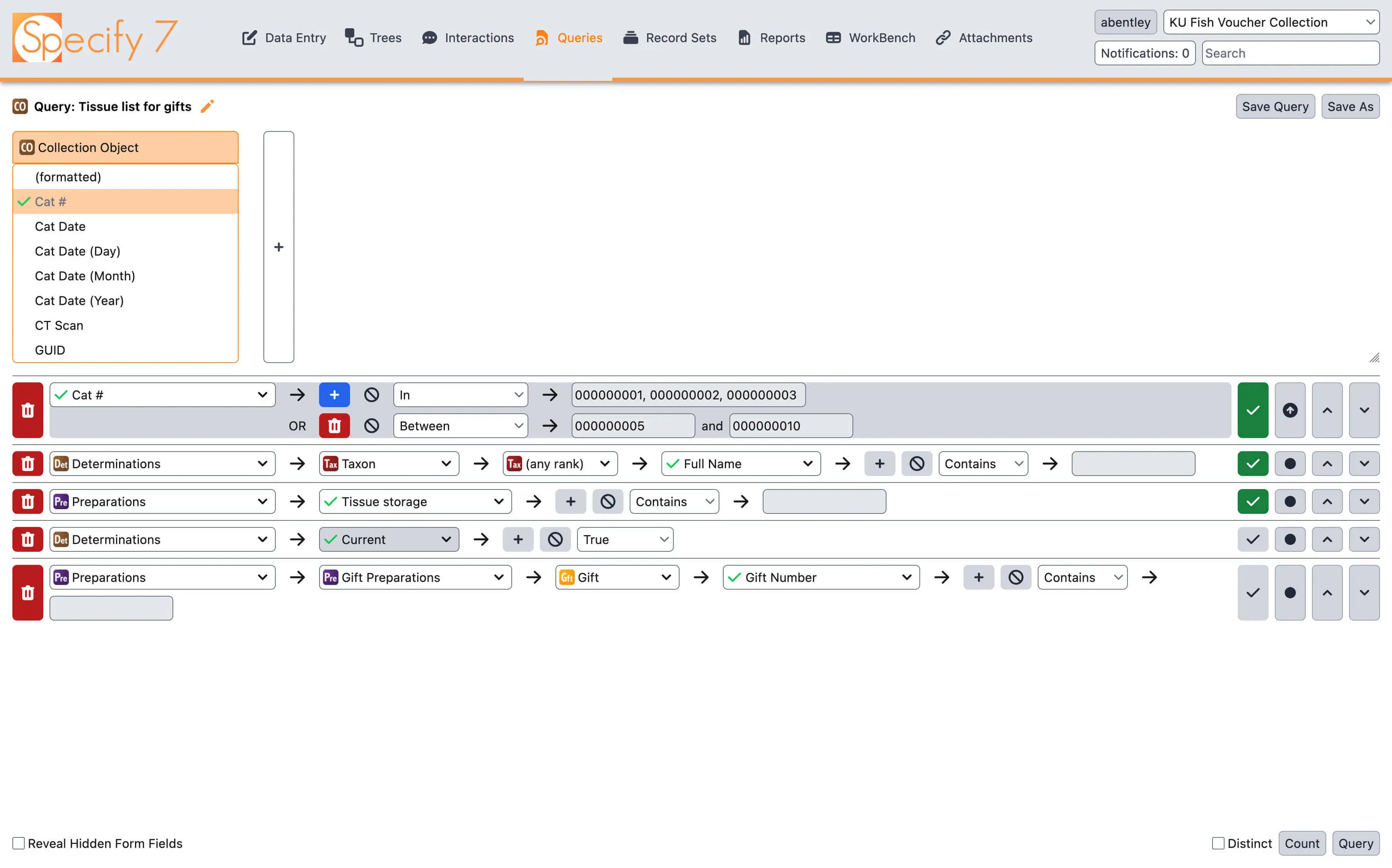
The styling has been completely rewritten to make it feel modern and consistent. Great attention was paid to focusing the user's attention on the most important actions, through clever use of color, position, and size
Tailwind CSS library has been added to handle all the styling needs. It makes styling things easier and helps keep everything consistent between the pages
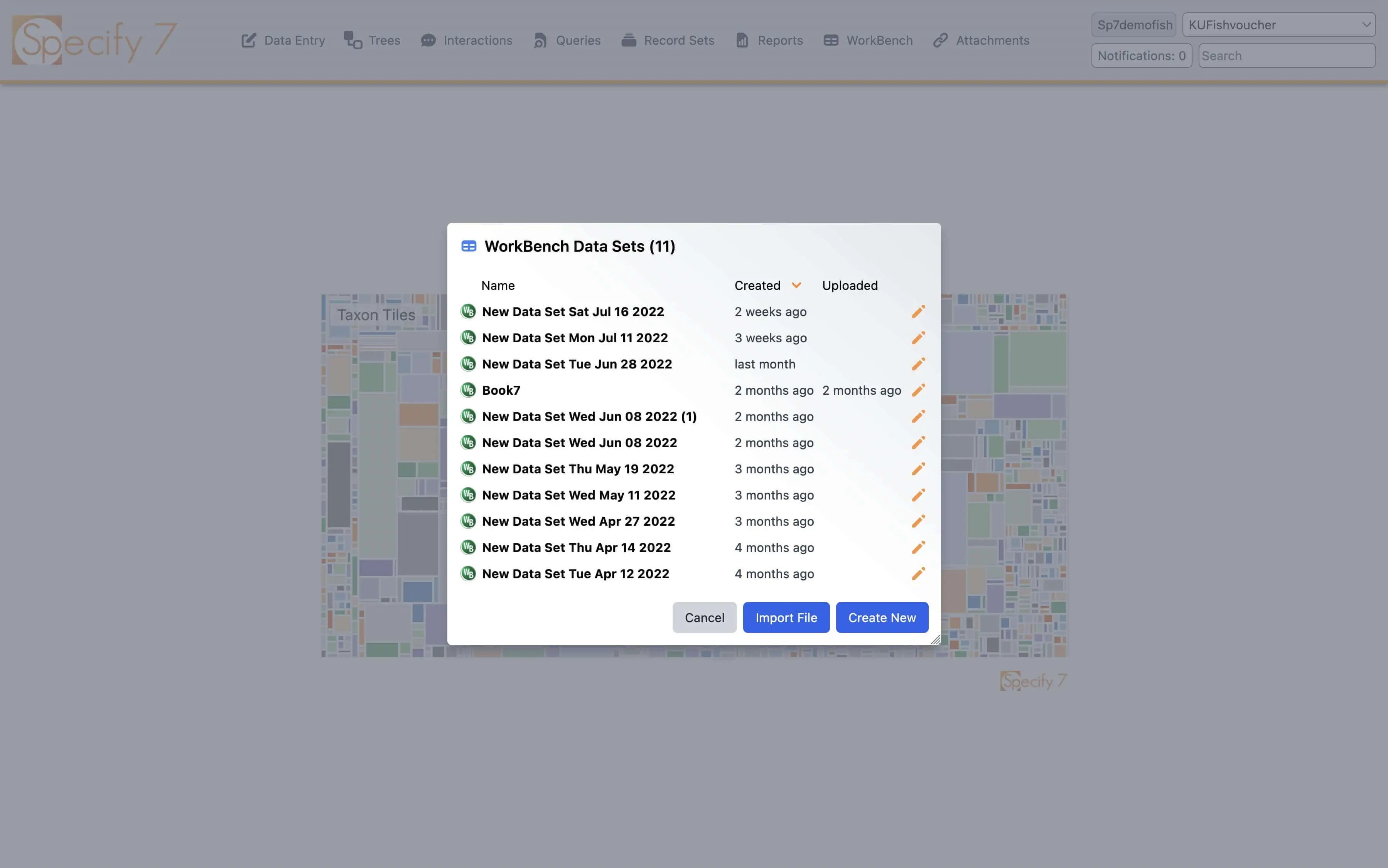
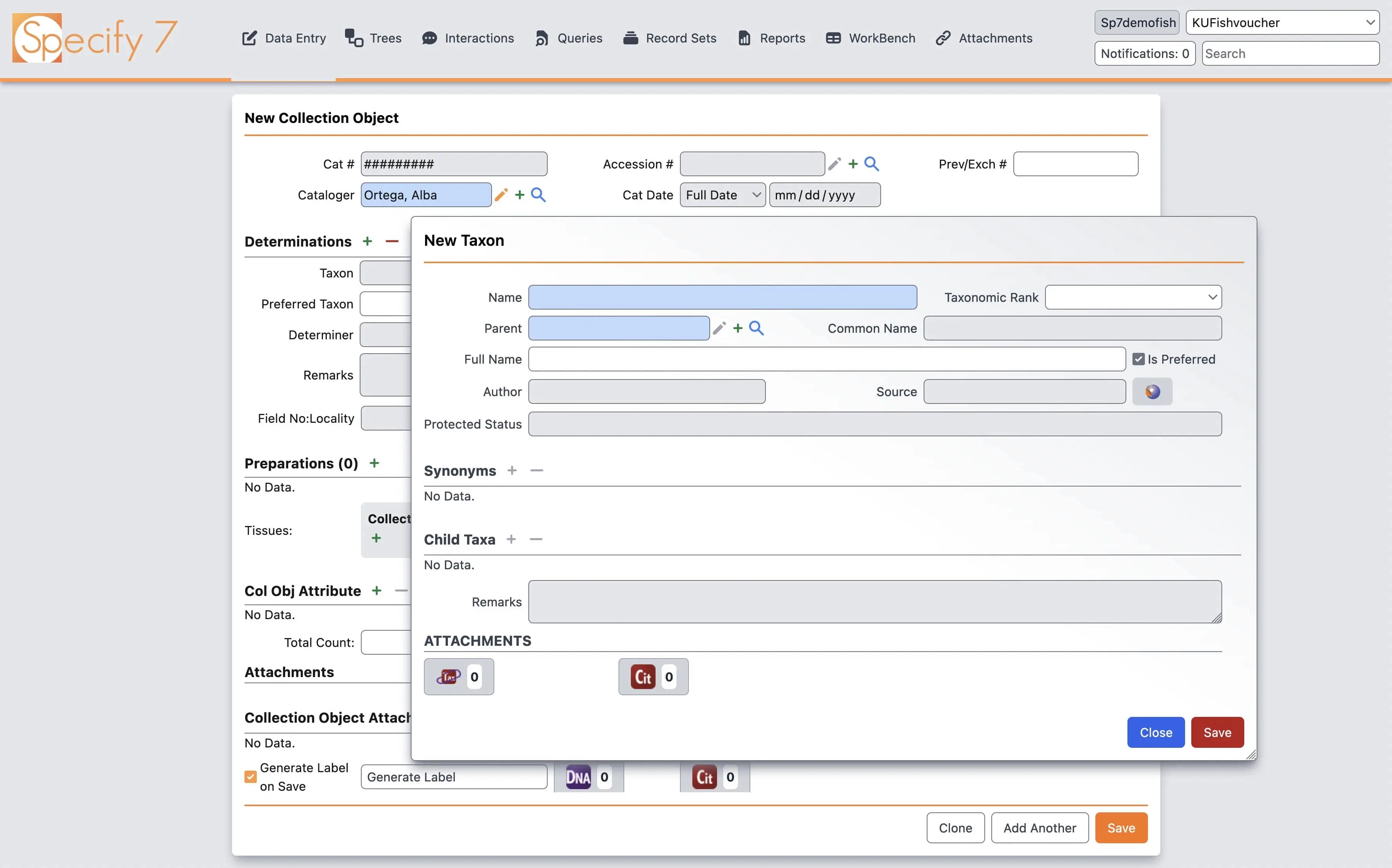
Modal dialogs are some of the most important parts of Specify 7 interface. They are used all over the place, from simple confirmation messages to complicated forms and elaborate grids. Thus, lots of thought was put into every detail. We debated the use of color in dialog buttons, the presence of an icon in the top corner, and the gentle gradient in the top right corner
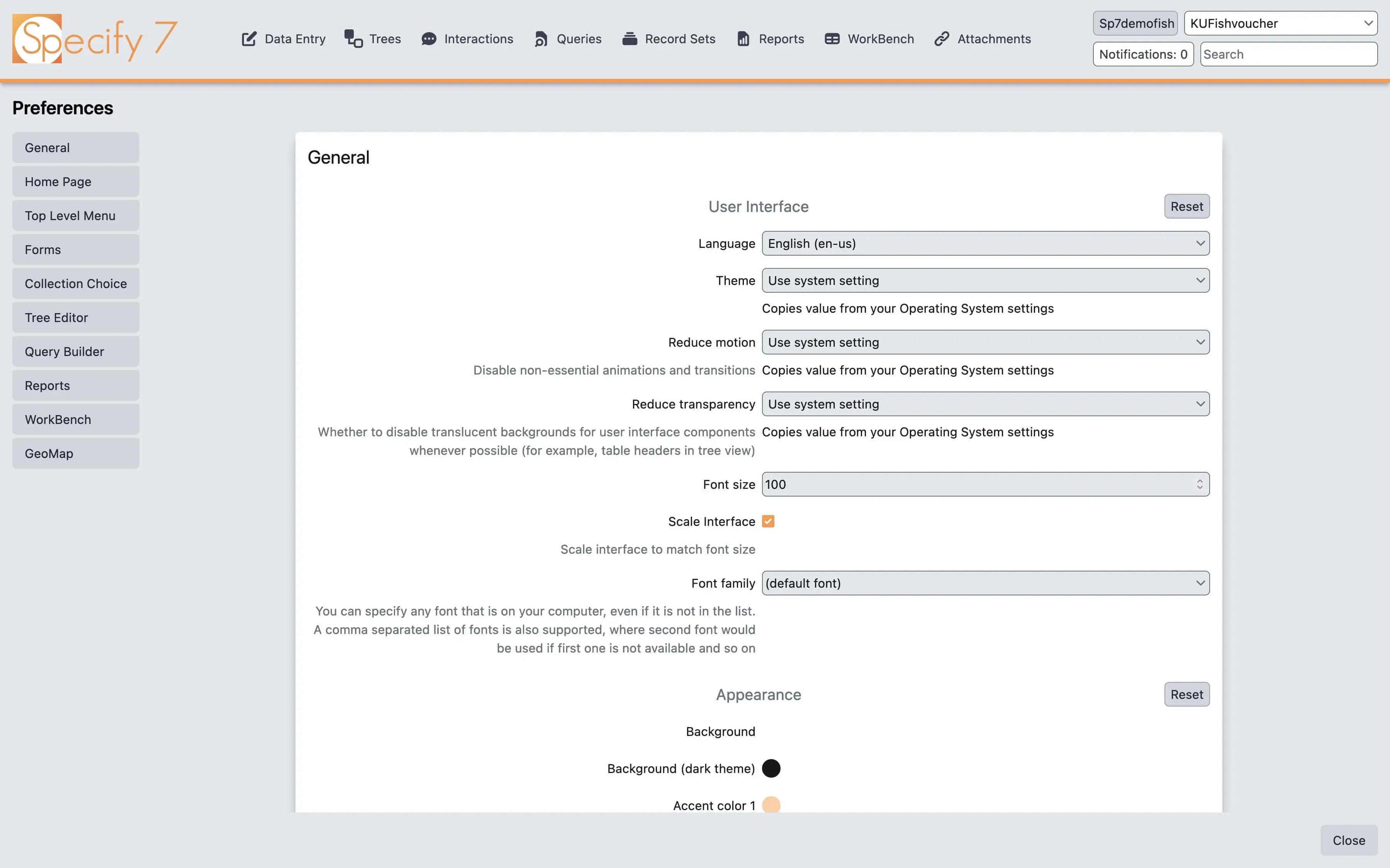
As part of our accessibility commitment and changes to become compliant with the WCAG 2.1 accessibility standard, ancient jQuery date pickers, sliders and modals were replaced with modern native components. Native components come with keyboard accessibility and screen reader support baked in, simplifying the development and keeping the user happy
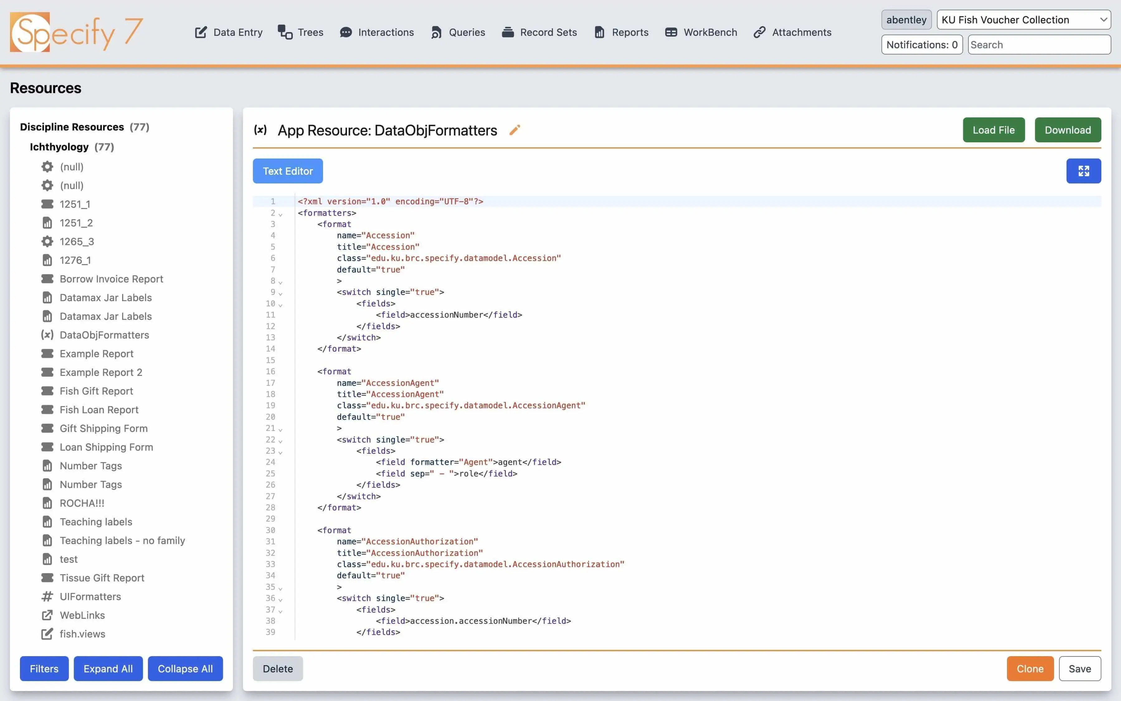
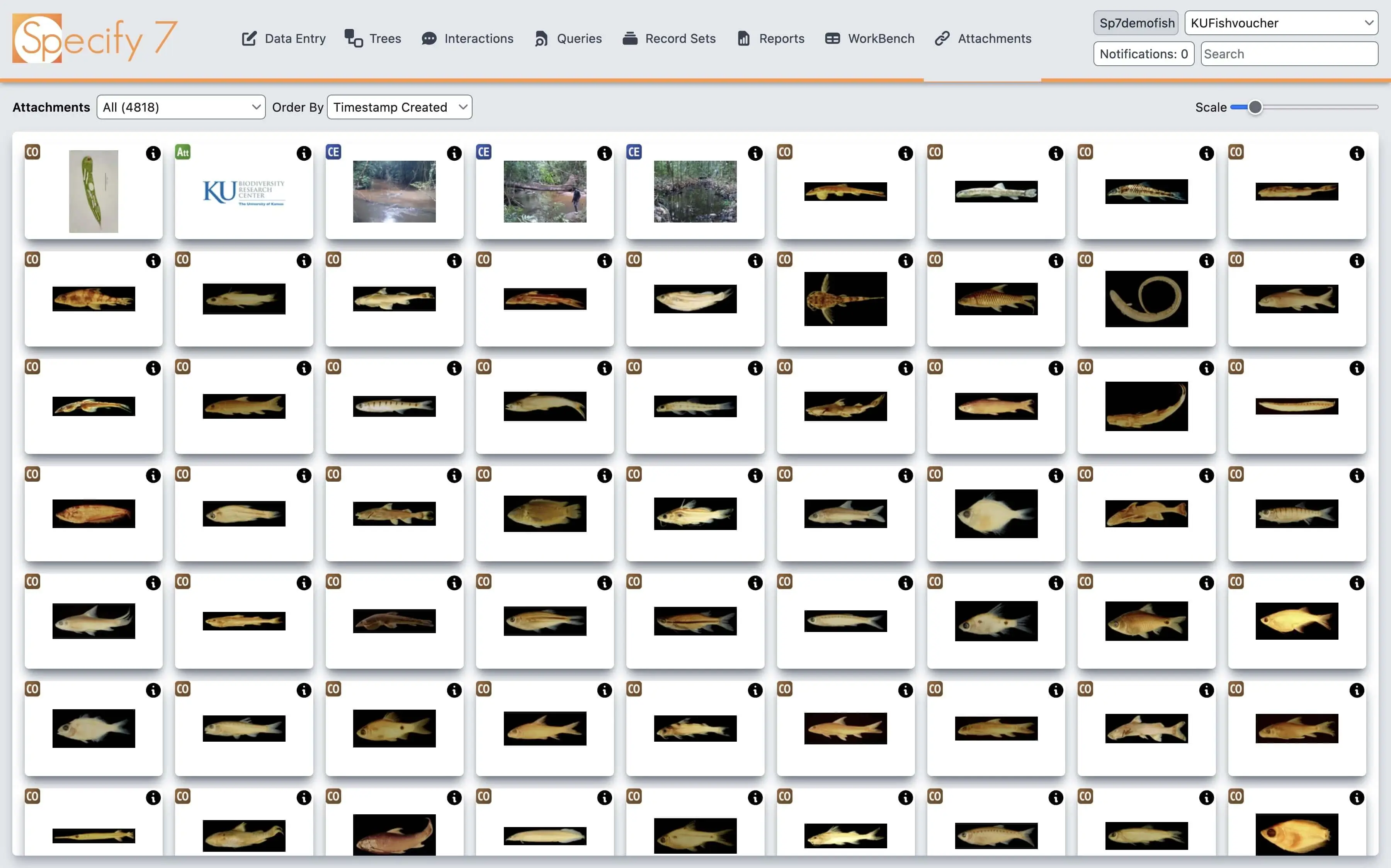
Screenshots
Recording of a webinar on user preferences in Specify 7
Recording of a webinar on accessibility improvements in Specify 7
Presentation from iDigBio Digital Data Conference 2022
Online demo
You can try out the live version at sp7demofish.specifycloud.org. The username and password are sp7demofish. When prompted to select a collection, choose any option. See usage instructions in the video above.
Guided demo
A video recording of a zoom show-and-tell session is available. It covers new features in the Specify 7.7 release and describes usability enhancements.
An overview of all new features in Specify 7.7 release.
Technologies used
Tailwind CSS
JavaScript
TypeScript
React
Things learned
In the process of redesigning the interface, I unconsciously made interface resemble my preferences and my usage habits. This way, dark mode received more attention, there were no animations or moving elements in the application, and drag & drop, context menus and other complicated interface elements were removed.
While this did not significantly affect the user experience, it is something I would pay more attention to in the future. I would try to get more input from others through the process and try to think about the project from the perspectives of a diverse set of users.